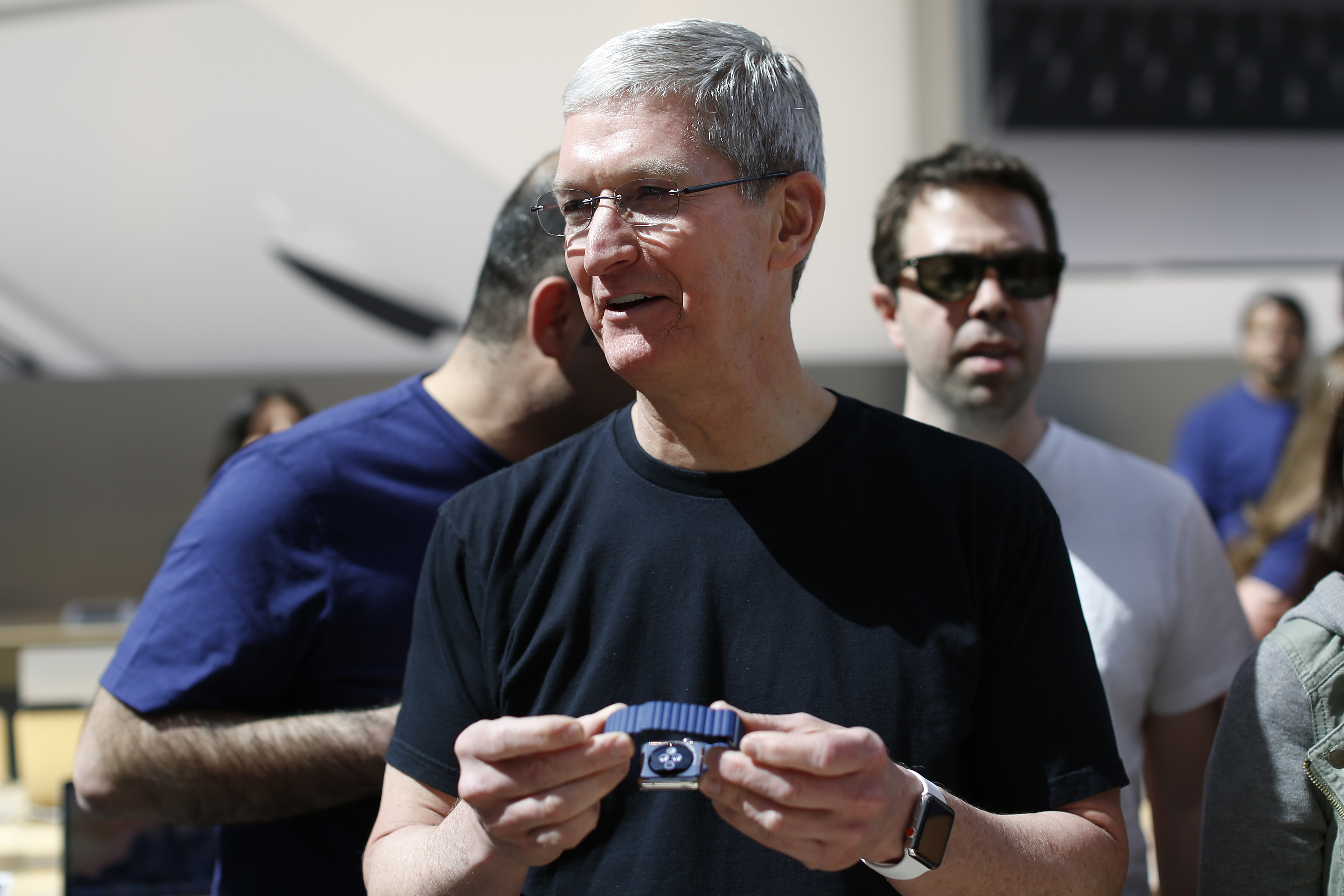
We got an unknowing first glimpse at the latest design of the Apple Watch, a stainless steel timepiece with a bright red crown cap1, more than two years ago—on the wrist of Tim Cook.

During the recent Apple Keynote, this small but obvious revision was the only notable visual change applied to the new Apple Watch. In this case, form didn’t follow function2. It was a flourish solely in place to signify differentiation.
To understand the rationale of this decision we must learn how Apple approaches creating a new product. First, they spend an inordinate amount of time understanding the domain. Jony Ive, much like Steve Jobs, is known for his obsessive nature as it applies to design.
In this research phase, they undoubtedly discovered that the principles of consumer hardware design do not necessarily cross over into the world of horology and fashion—specifically the design language of ornamentation. The utility of a certain object doesn’t necessarily increase with price. A diamond encrusted sapphire vessel doesn’t carry liquid better than a plastic water bottle. In this world, form is the function.
In any kind of artistic pursuit, it is almost a prerequisite to study the greats that came before you. While apocryphal in nature, it is said that Picasso could mimic the work of great artists like Raphael at a very young age. It was only after much studying and painting, was he able to develop his own form of expression. You have to know the rules before you break them. This deep understanding translates into care and respect in the creation process.
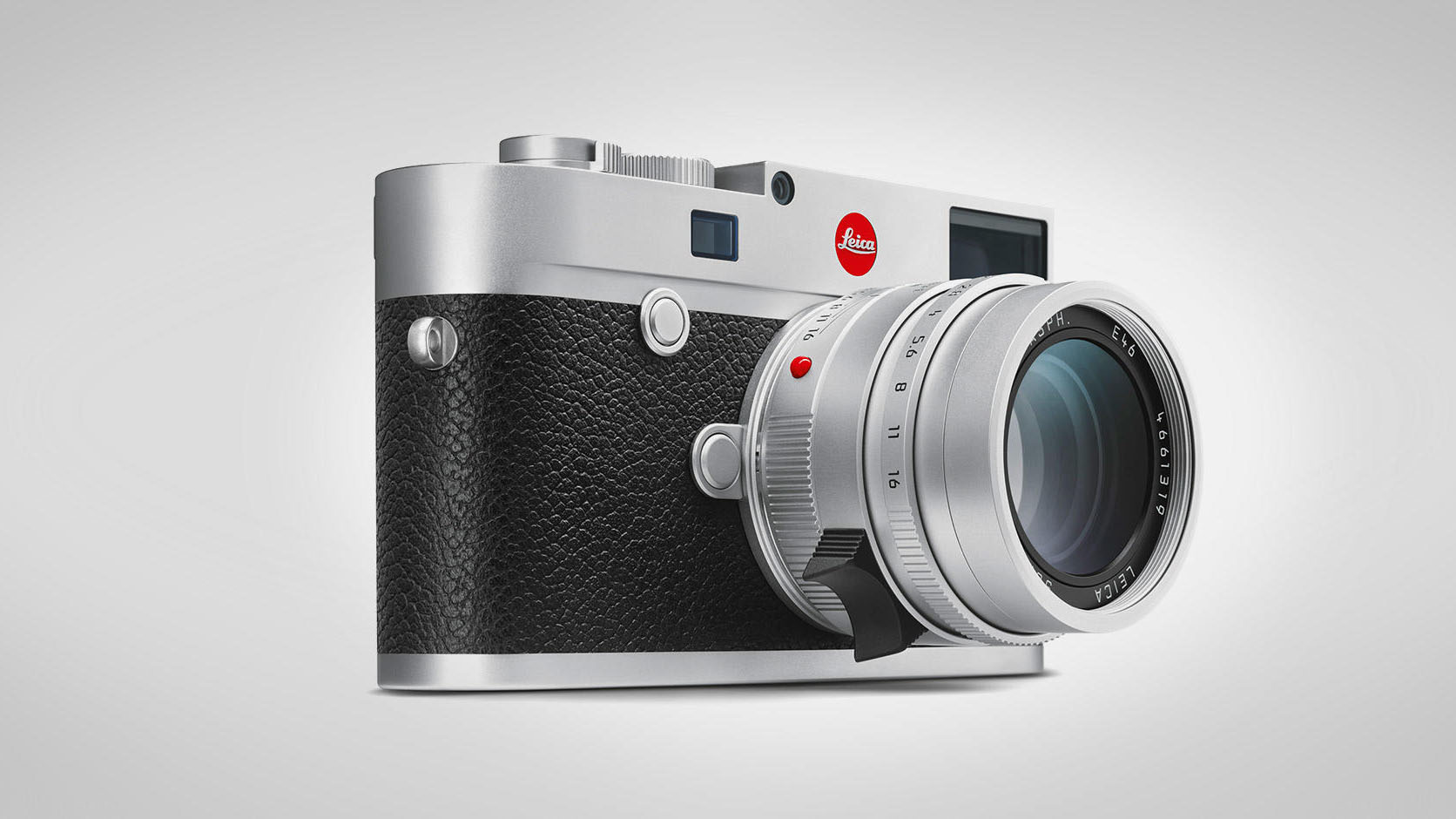
This ideology is pervasive across many industries that share similar characteristics. Leica’s brand is iconic due to their distinct red mark which it has used since 1913. It is instantly recognizable.

French fashion designer, Christian Louboutin, employs a similar technique, coating the soles of the shoes he creates in a bright glossy red. A bold differentiated identity like this easily permeates pop culture. In one of this summers most popular songs, Bodak Yellow, Cardi B raps about her Loubotins, cleverly tying the reference into a thinly veiled gang association. Color can be used to great effect in signaling exclusivity, telling a story and creating a brand.

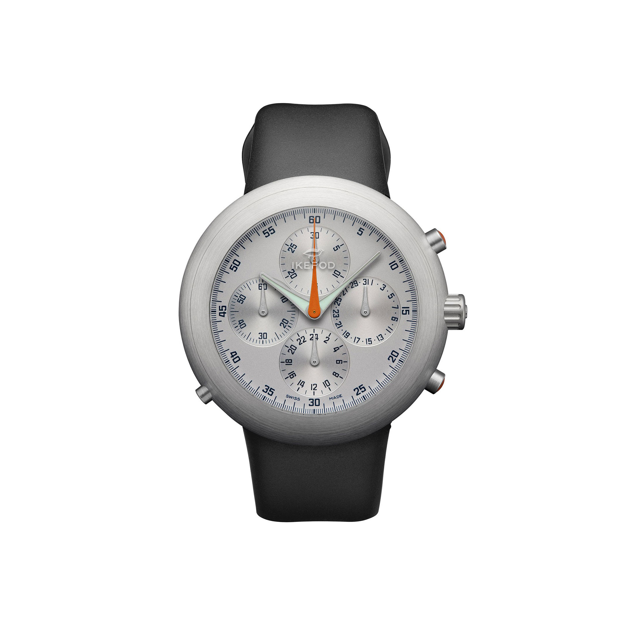
In horology watchmakers use color as a tool to differentiate between editions and various releases constantly. Industrial designer and long time Ive collaborator, Marc Newson, has created several watches that Ive has drawn inspiration from for the Apple Watch. Newson’s Hemipode Watch also features red caps, adorned on secondary buttons.

It would be remiss to talk about the design history at Apple and not talk about Dieter Rams. His work, inline with his principles, showcases color sparingly to draw attention to key features.

Stepping up into a higher level of design abstraction leads us into the symbology of color. There are many facets of meaning one can derive out of red, from the deeply cultural bindi to the iconic HAL 9000—it covers the gamut. Red also evokes feelings from anger, to passion and excitement. It draws us in to our devices with notifications and communicates warning signs. All these things can be expressed in the many shades of red.
By nature, changing anything that touches so many people always elicits a reaction. If you want an LTE enabled Apple Watch, you’re getting a red crown cap—a decidedly non-neutral color is now the only option. In the past, you had some semblance of choice in getting a non-neutral color. This small red dot breaks the modular styling of the watch. For better or worse, the watch design team decided that this marker and what it represents was of greater importance.
Technically the 38mm 18-Karat Yellow Gold Apple Watch Edition was the first instance of a red crown cap. ↩︎
In previous versions, the more expensive steel and edition watches always had this cap while the cheaper aluminum models did not. This rules out the idea that there is a functional benefit to having it in place. I initially thought it had something to do with the antenna—it does not. The antenna is built into the screen. ↩︎