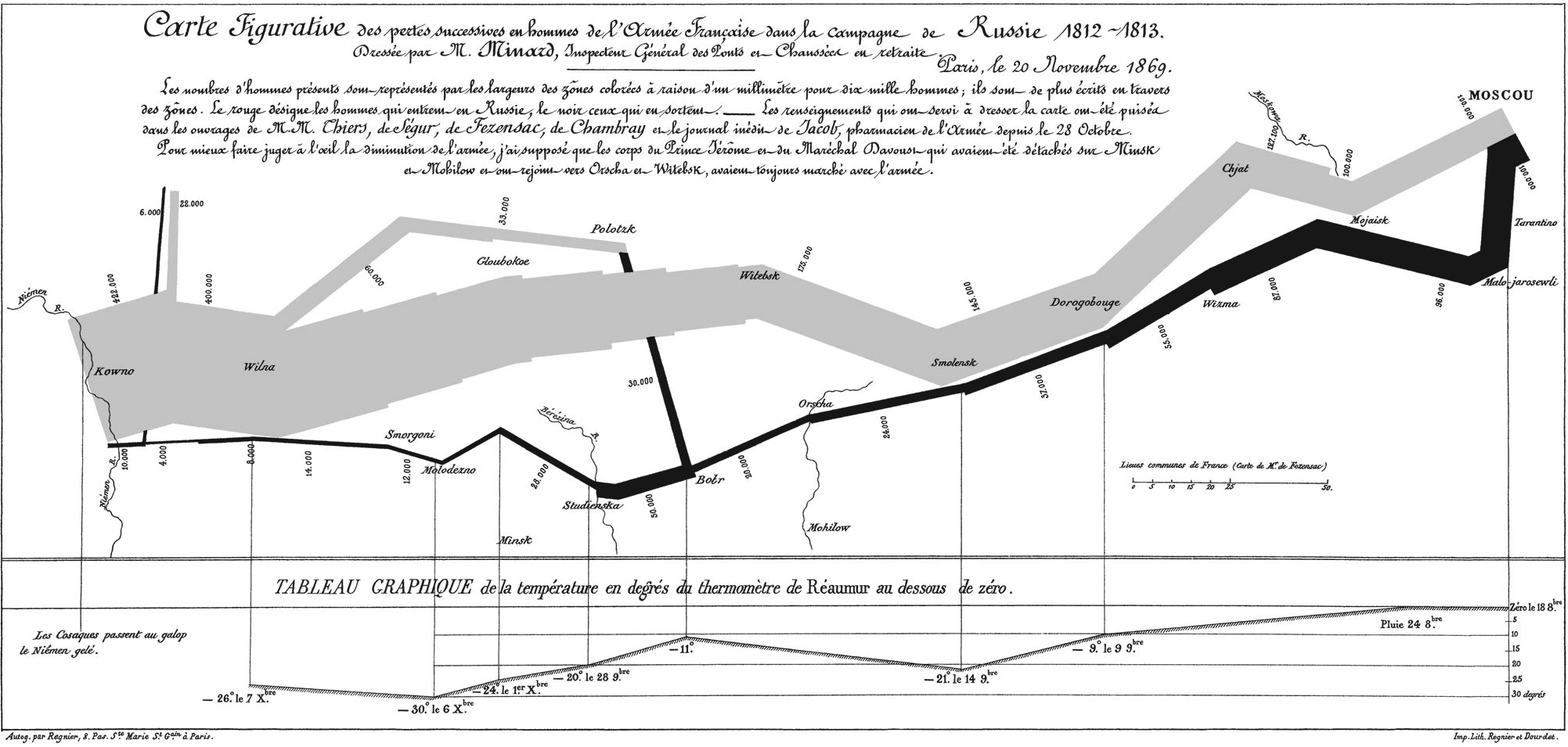

In the spirit of Dieter Rams’s ten principles for good design, here is a list of five principles for good data visualization1. These axioms serve as a lens that one might use to evaluate quantitative drawings. It’s not meant to be exhaustive but rather open to continuous evolution.
1. Good data visualization is informative
Well presented data forms the backbone of a compelling story. It has the power to strengthen and illuminate a narrative—improving understanding and focusing on what’s important.
2. Good data visualization is well balanced
Communicating quantitative data effectively requires the right balance of components. Color is used with purpose and is not distracting. All parts are labeled and include a legend when necessary. The scale of the visualization must be immediately identifiable. The standard lexicon of graphs are often all that is required—do not use pie charts.
3. Good data visualization is equally concerned with what is not displayed
People are easily overwhelmed with extraneous details. Simplify and reduce what is being presented to what is essential.
4. Good data visualization is created with pure data
Avoid utilizing muddy or incomplete sources of data. Misleading the audience with false information or lack of clarity is in poor taste. Ultimately, good data visualization enables better decisions and actions.
5. Good data visualization is human
Parsing large data quantities of data is beyond human perception. The goal with any kind of data visualization is to augment and improve human perception. Just like a microscope it allows us to explore data within the realm of our understanding.
Derived from the collective research of Edward Tufte and Stephen Few. ↩︎